


Congenial Italic Ultra Light
in Fonts / Sans-Serif Fonts
DOWNLOAD NOW Report
110
0
YOU MAY ALSO LIKE:
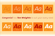


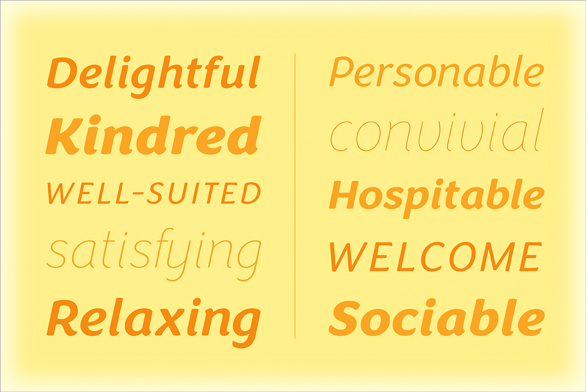
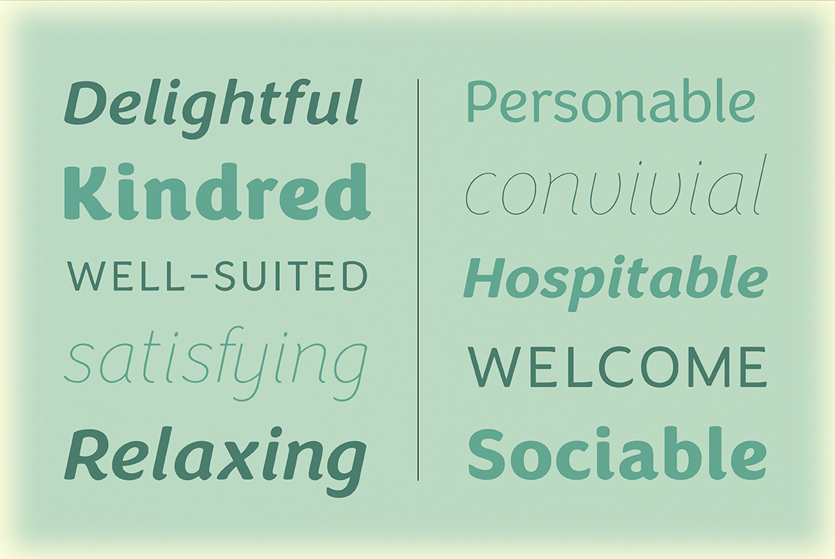
I wanted to design my own sans-serif typeface for my web site to complement the rest of my type library, so I designed Congenial as an understated, highly legible complement to my more decorative display faces. Of course, I’m never far from my calligraphic roots, so Congenial retains some hand-drawn elements, visible particularly in the heavier weights of this generous 10-face family*(see note below): for example, the swelling diagonal stroke of the capital X, and the flared terminals of the K, L, Q, and Z. At lighter weights the strokes become almost monoline, but the humanist tendency is still evident — see the graceful, decidedly non-geometric curves of the k, e, and g.
As befits its name, Congenial is a friendly and inviting face with a generous x-height and highly differentiated characters. In fact, look closely and you won’t see a sharp, modernist edge anywhere. Like a perfect host, Congenial draws little attention to herself, yet she’s arranged everything for effortless comfort — so you can focus on communicating whatever you need to say.
*Note: This listing is for Congenial Ultra Light Italic Only. Images display this weight working with other weights, which are available separately or in the Congenial Italic Family.
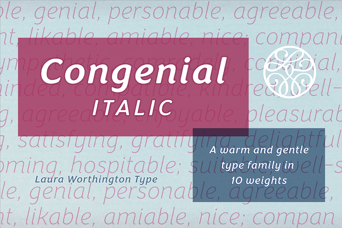
The Congenial Italic Font Family is available here: https://creativemarket.com/L_Worthington/2097305-Congenial-Italic-Family
As befits its name, Congenial is a friendly and inviting face with a generous x-height and highly differentiated characters. In fact, look closely and you won’t see a sharp, modernist edge anywhere. Like a perfect host, Congenial draws little attention to herself, yet she’s arranged everything for effortless comfort — so you can focus on communicating whatever you need to say.
*Note: This listing is for Congenial Ultra Light Italic Only. Images display this weight working with other weights, which are available separately or in the Congenial Italic Family.
The Congenial Italic Font Family is available here: https://creativemarket.com/L_Worthington/2097305-Congenial-Italic-Family
| File Type: | TTF, OTF, PDF |
| File Size: | 1.31 |
| Vector: | Yes |