Delittle Chromatic
in Fonts / Display Fonts
DOWNLOAD NOW Report
238
0
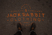
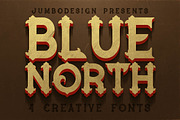
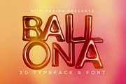
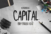
YOU MAY ALSO LIKE:

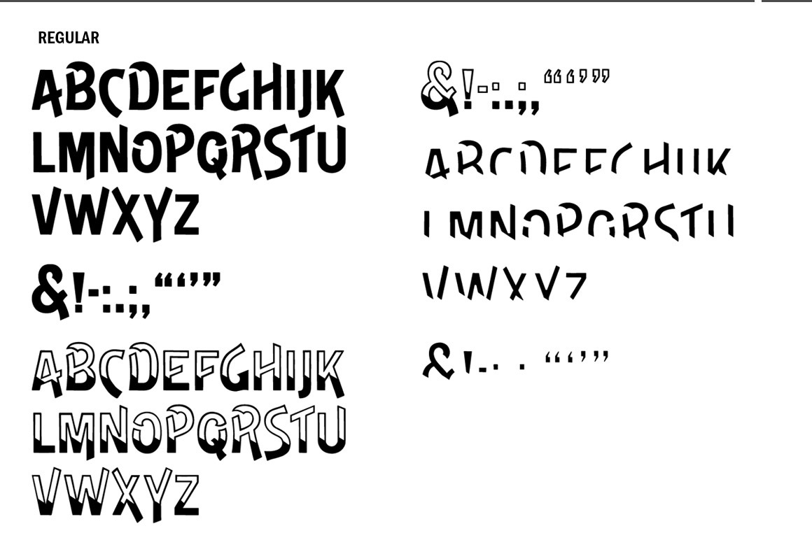
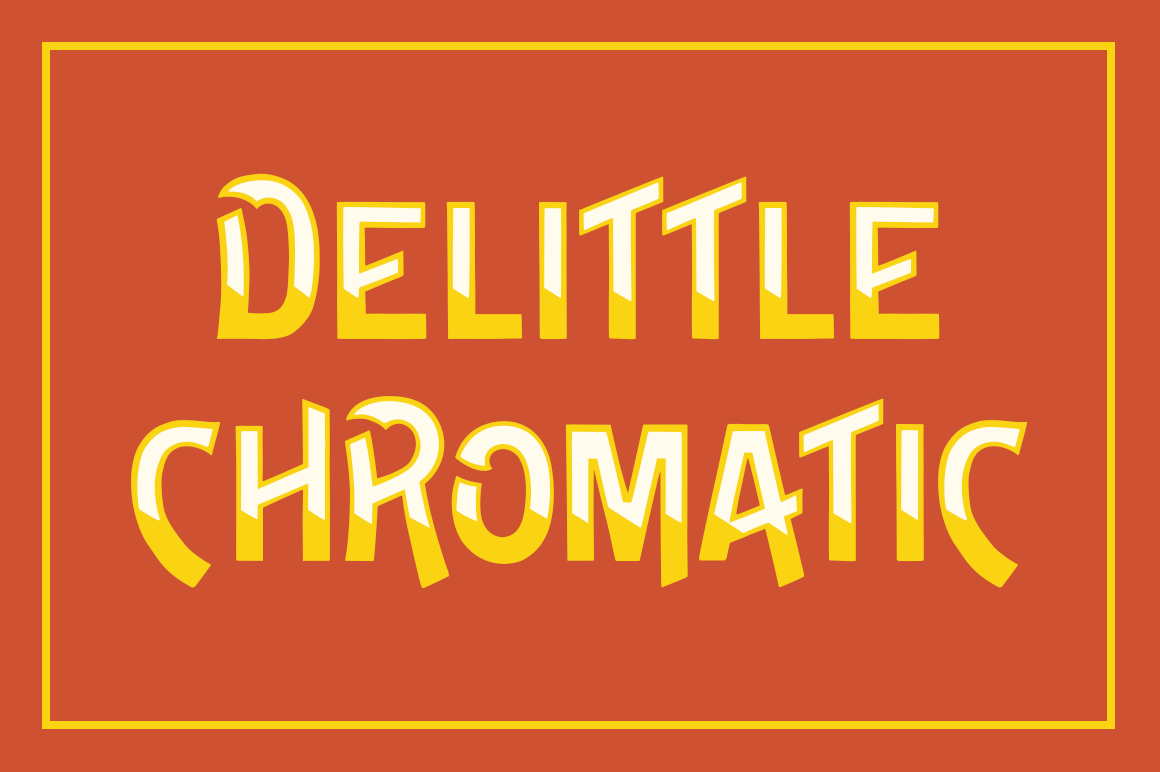
DeLittle Chromatic is a distinctively British display face in two colors. Its forms alternate between comical sweeps and rigid brutalism; it always has a frenetic, undulating motion due to the wild variance in character heights.
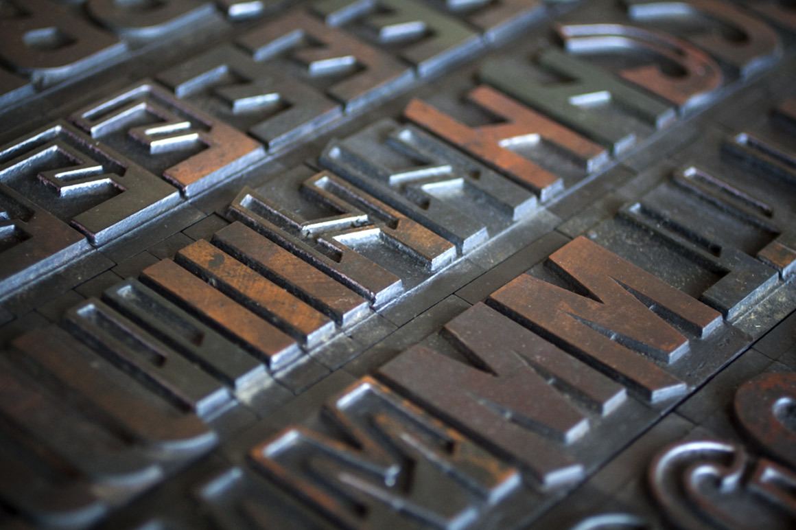
DeLittle Chromatic was issued by DeLittle of York around the turn of the century under the name No. 56/54.
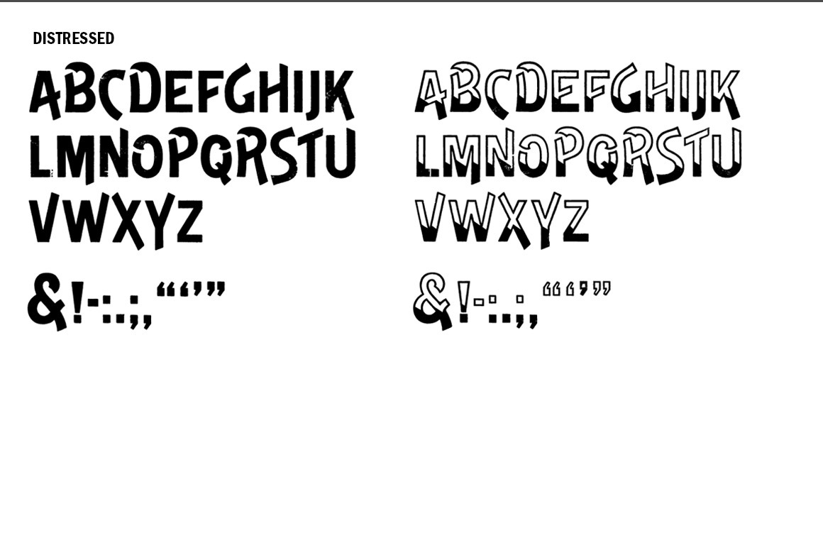
The font includes three regular weights and two distressed weights. The regular weights are clean, precise redraws which capture the contours of the original wood type. The distressed weights are renderings of the the textures of the letterpress proof itself, warts and all. The distressed weights feature alternate characters with extra dings and blemishes, set as the lowercase keyboard characters.
Both regular and distressed weights come in fill and outline variations. The regular wight also includes a special inlay variations. When doing traditional registered two-color work, we recommend using fill and inlay, but the outline weight also has benefits when paired with the fill weight, and as a standalone.
WTR DeLittle Chromatic was drawn from 16-line (192 point) wood type. It is a display face, and is best used at larger sizes.
Because wood type was created for headlines, fonts of wood type rarely have extensive character palettes. The characters pictured above are the historically accurate glyphs represented in this font.
DeLittle Chromatic was issued by DeLittle of York around the turn of the century under the name No. 56/54.
The font includes three regular weights and two distressed weights. The regular weights are clean, precise redraws which capture the contours of the original wood type. The distressed weights are renderings of the the textures of the letterpress proof itself, warts and all. The distressed weights feature alternate characters with extra dings and blemishes, set as the lowercase keyboard characters.
Both regular and distressed weights come in fill and outline variations. The regular wight also includes a special inlay variations. When doing traditional registered two-color work, we recommend using fill and inlay, but the outline weight also has benefits when paired with the fill weight, and as a standalone.
WTR DeLittle Chromatic was drawn from 16-line (192 point) wood type. It is a display face, and is best used at larger sizes.
Because wood type was created for headlines, fonts of wood type rarely have extensive character palettes. The characters pictured above are the historically accurate glyphs represented in this font.
| File Type: | OTF, PDF |
| File Size: | 305.39 KB |