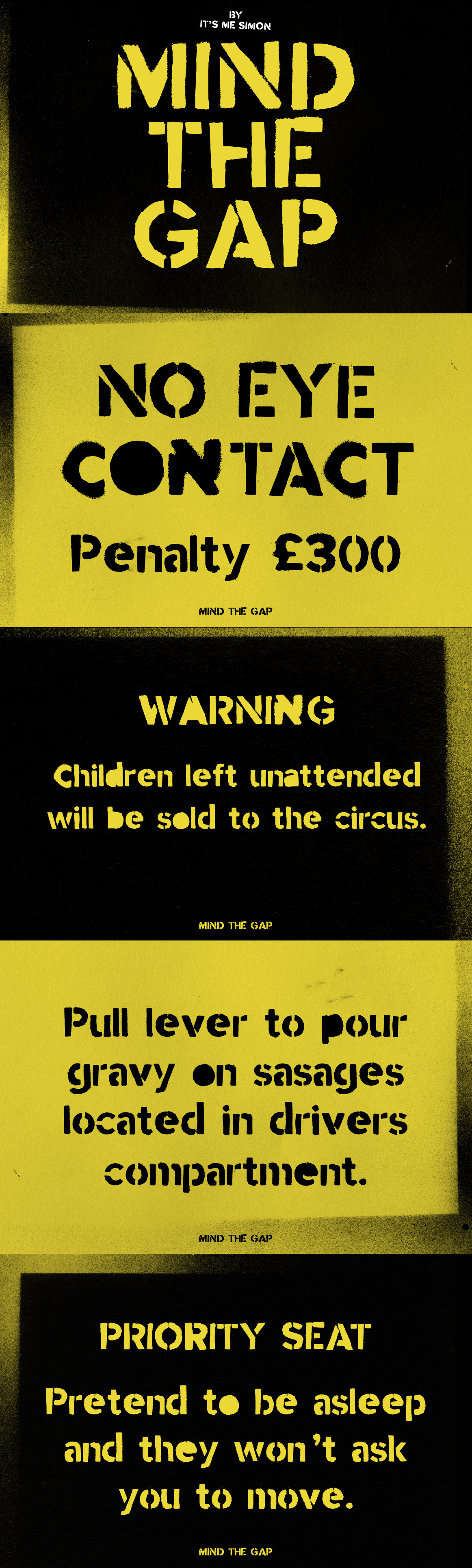


Mind the Gap stencil font
in Fonts / Military Fonts
DOWNLOAD NOW Report
269
1
YOU MAY ALSO LIKE:
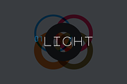
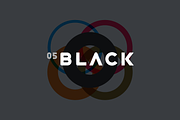
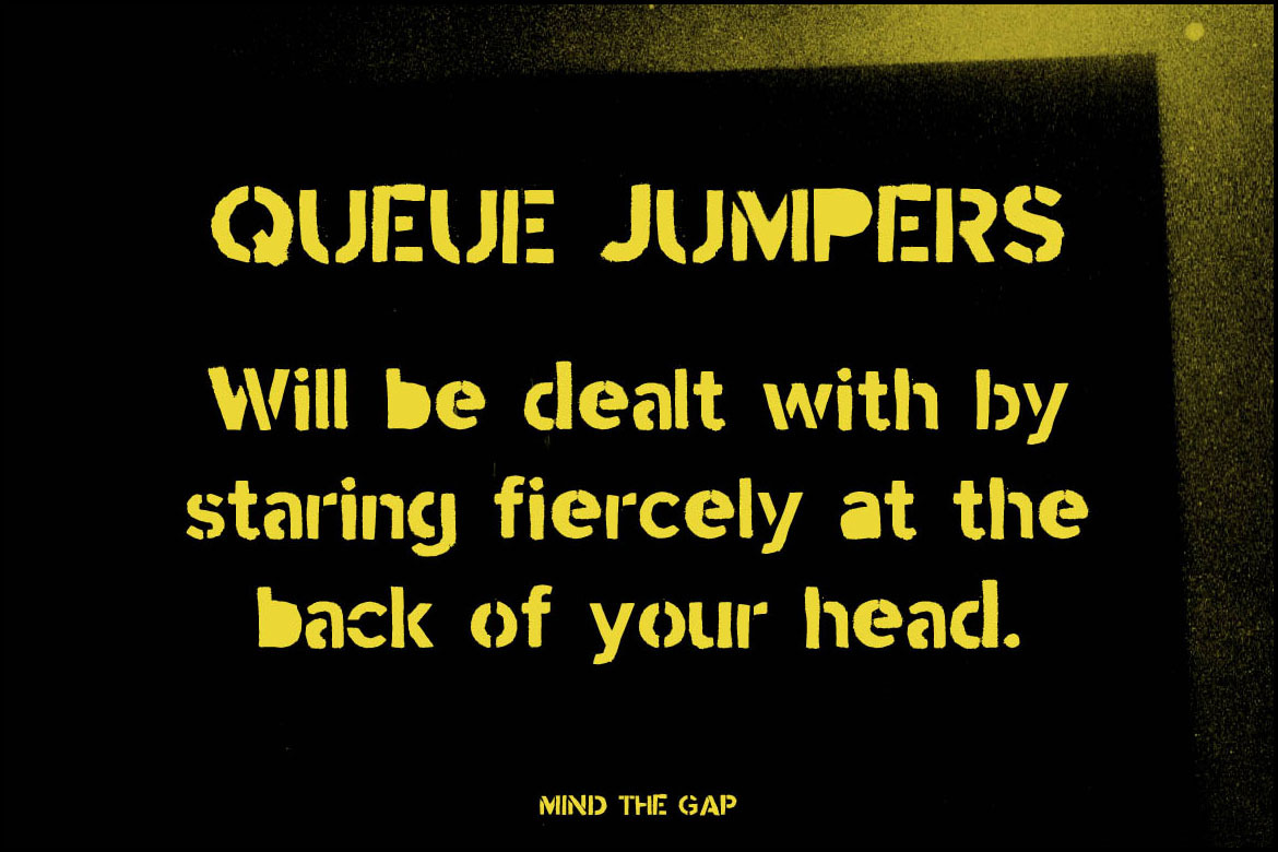
A modern stencil font Mind the Gap was born out of the frustration of the love/hate relationship I have of the daily commute.
I'm not sure if it's just a London thing or if it's the same in New York City, Paris, Madrid, Seoul, Shanghai, Beijing, Mexico City, Moscow, Tokyo and Berlin.
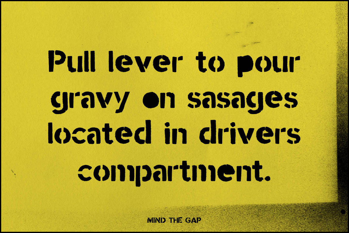
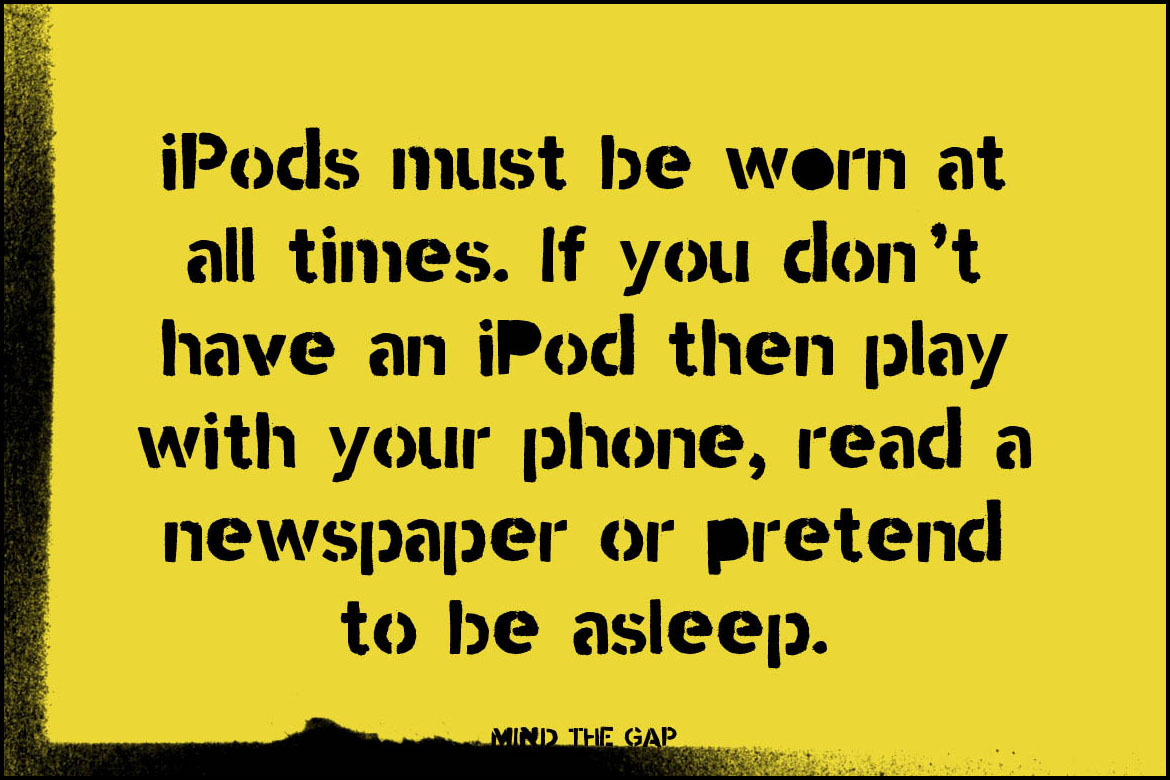
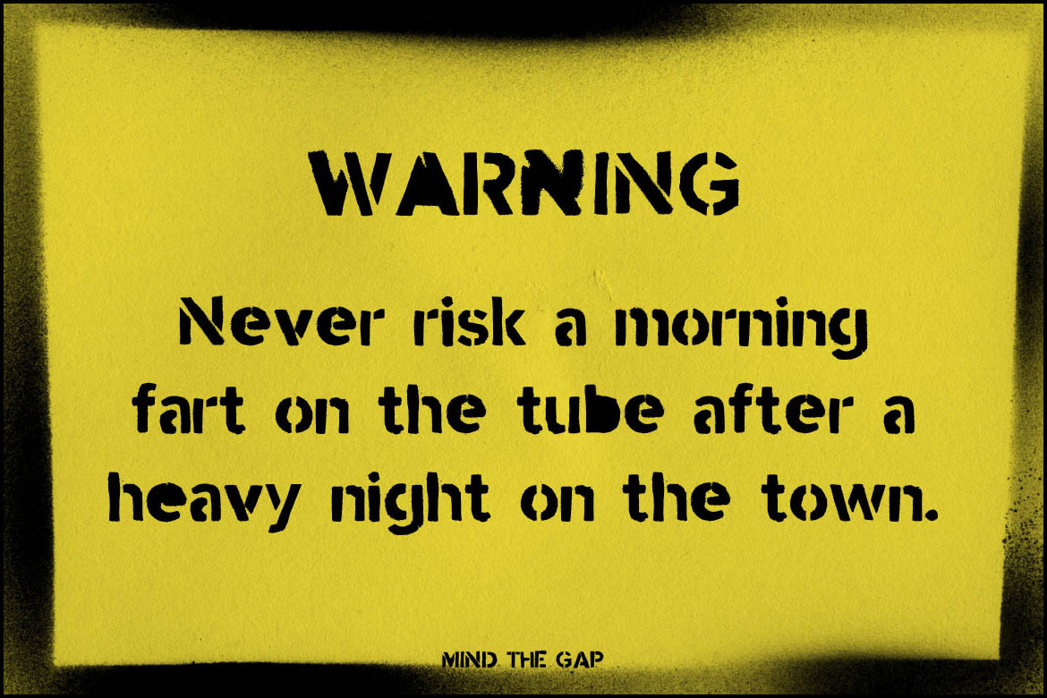
It was created by hand cutting letter stencils and spraying them with black paint. This gives it an industrial almost military look and feel.
It's deliberately not perfect I wanted it to be dirty so it looks more real and has a bit of personality.
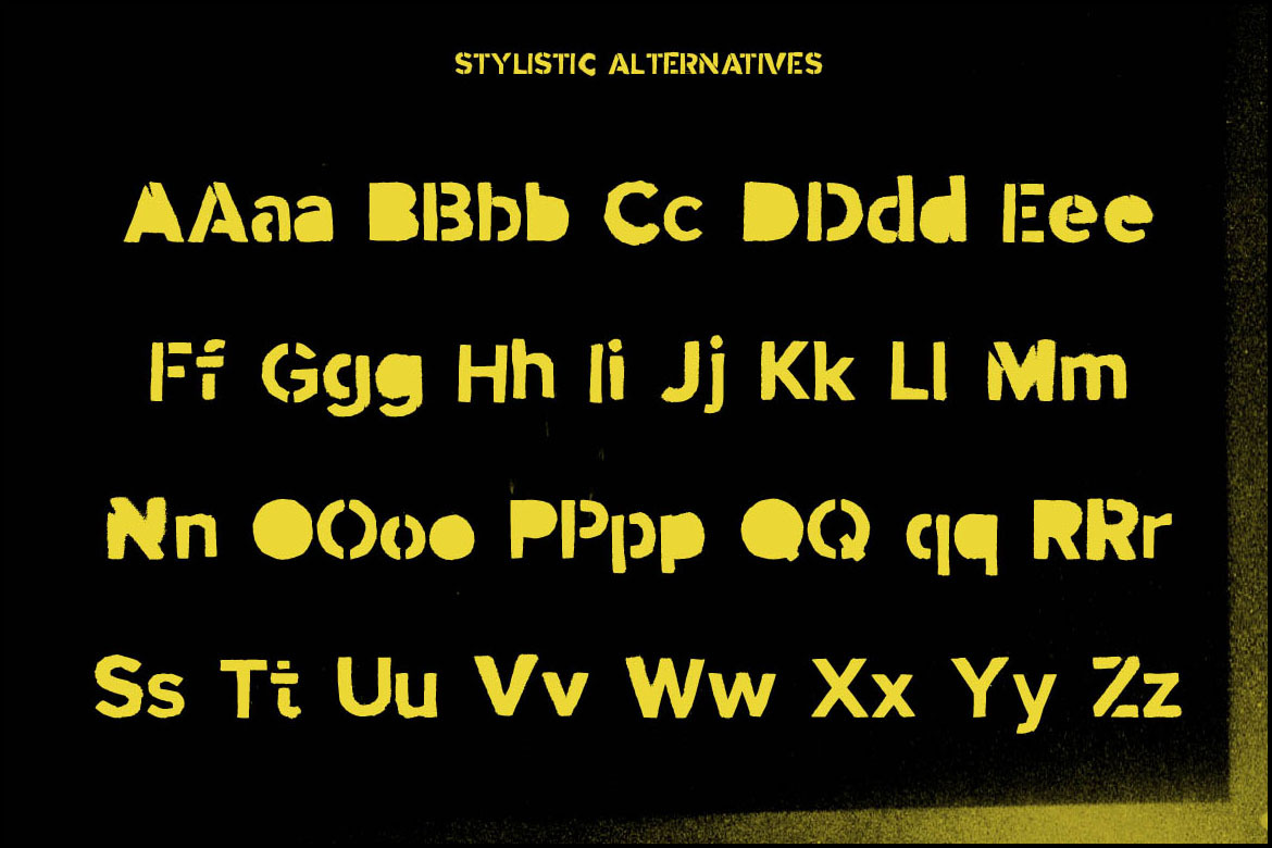
It includes one stylistic alternative for uppercase and lowercase A-Z. Plus an additional stylistic alternative for A,B,D,O,P,Q,R and a,b,d,e,g,o,p,q and three alternatives for numbers.
That means is you can change out repeated glyphs with alternatives. You can watch a quick demo on how to do this in Photoshop CC—https://youtu.be/YeUek2nZJu4
**Includes;**
- One weight
- Uppercase and Lowercase
- Numbers
- Punctuation & Symbols
- Stylistic sets
- Western European characters
- Central European characters
- South Eastern European characters
- OTF
Take it for a spin at http://simonstratford.com/mind-the-gap-font/
---
**Check out** my other fonts—http://bit.ly/itsmesimon
I'm not sure if it's just a London thing or if it's the same in New York City, Paris, Madrid, Seoul, Shanghai, Beijing, Mexico City, Moscow, Tokyo and Berlin.
It was created by hand cutting letter stencils and spraying them with black paint. This gives it an industrial almost military look and feel.
It's deliberately not perfect I wanted it to be dirty so it looks more real and has a bit of personality.
It includes one stylistic alternative for uppercase and lowercase A-Z. Plus an additional stylistic alternative for A,B,D,O,P,Q,R and a,b,d,e,g,o,p,q and three alternatives for numbers.
That means is you can change out repeated glyphs with alternatives. You can watch a quick demo on how to do this in Photoshop CC—https://youtu.be/YeUek2nZJu4
**Includes;**
- One weight
- Uppercase and Lowercase
- Numbers
- Punctuation & Symbols
- Stylistic sets
- Western European characters
- Central European characters
- South Eastern European characters
- OTF
Take it for a spin at http://simonstratford.com/mind-the-gap-font/
---
**Check out** my other fonts—http://bit.ly/itsmesimon
| File Type: | PDF, OTF |
| File Size: | 1.4 |
| Vector: | Yes |