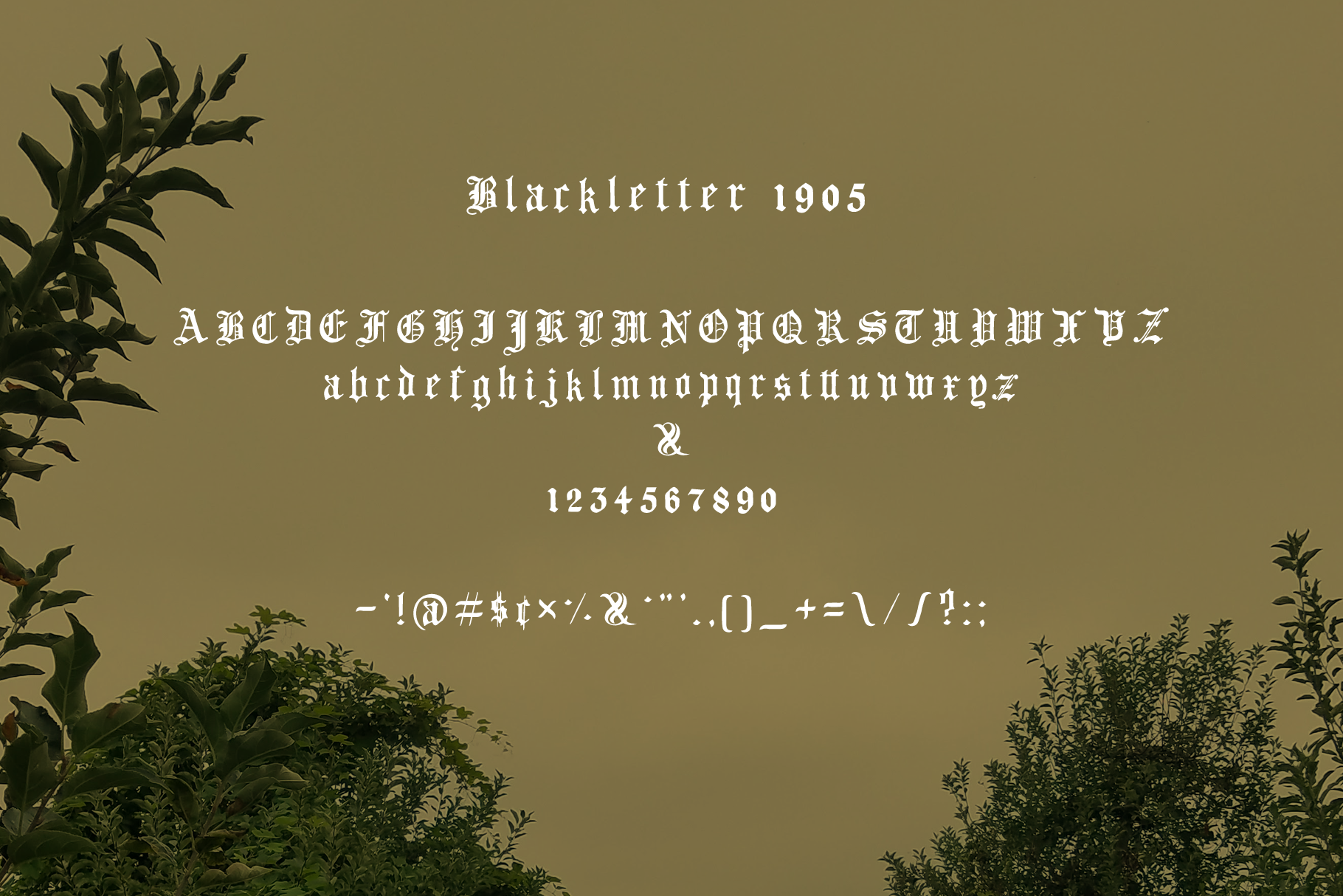
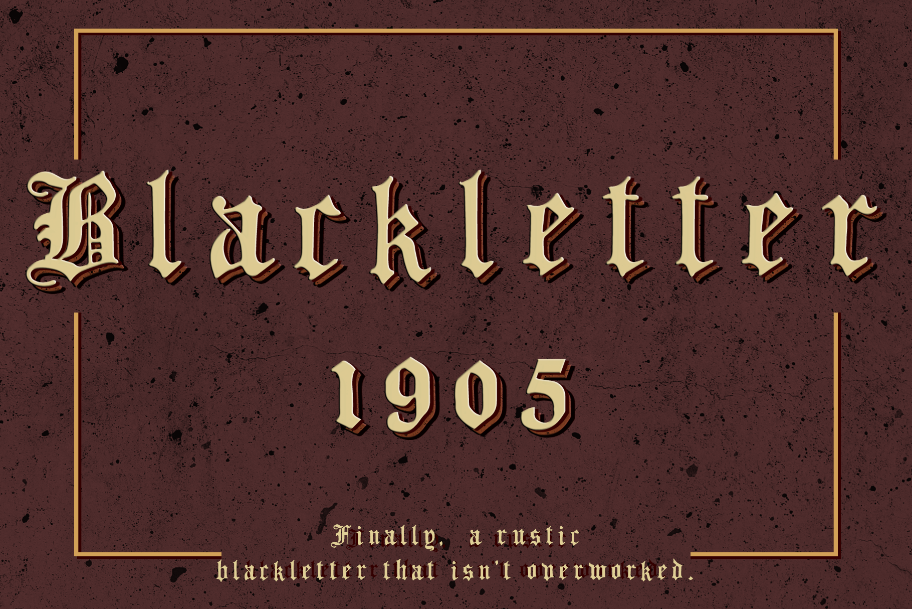
Blackletter 1905 Rustic Vintage Font
in Fonts / Blackletter Fonts
DOWNLOAD NOW Report
301
4
YOU MAY ALSO LIKE:


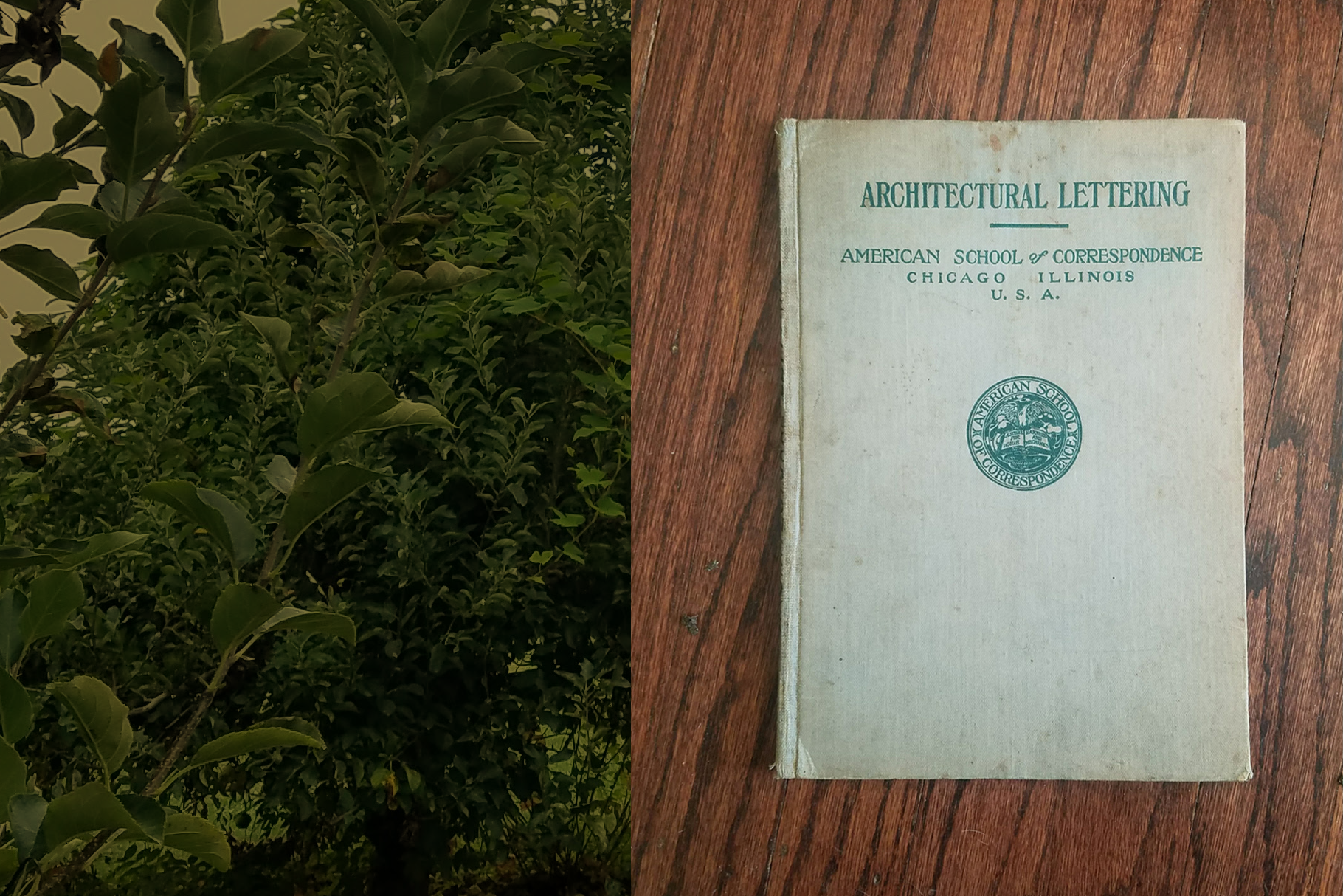
Blackletter 1905 is the second font in a series I'm archiving from an old architectural correspondence course book I found one fateful day while estate sale shopping with my wife.
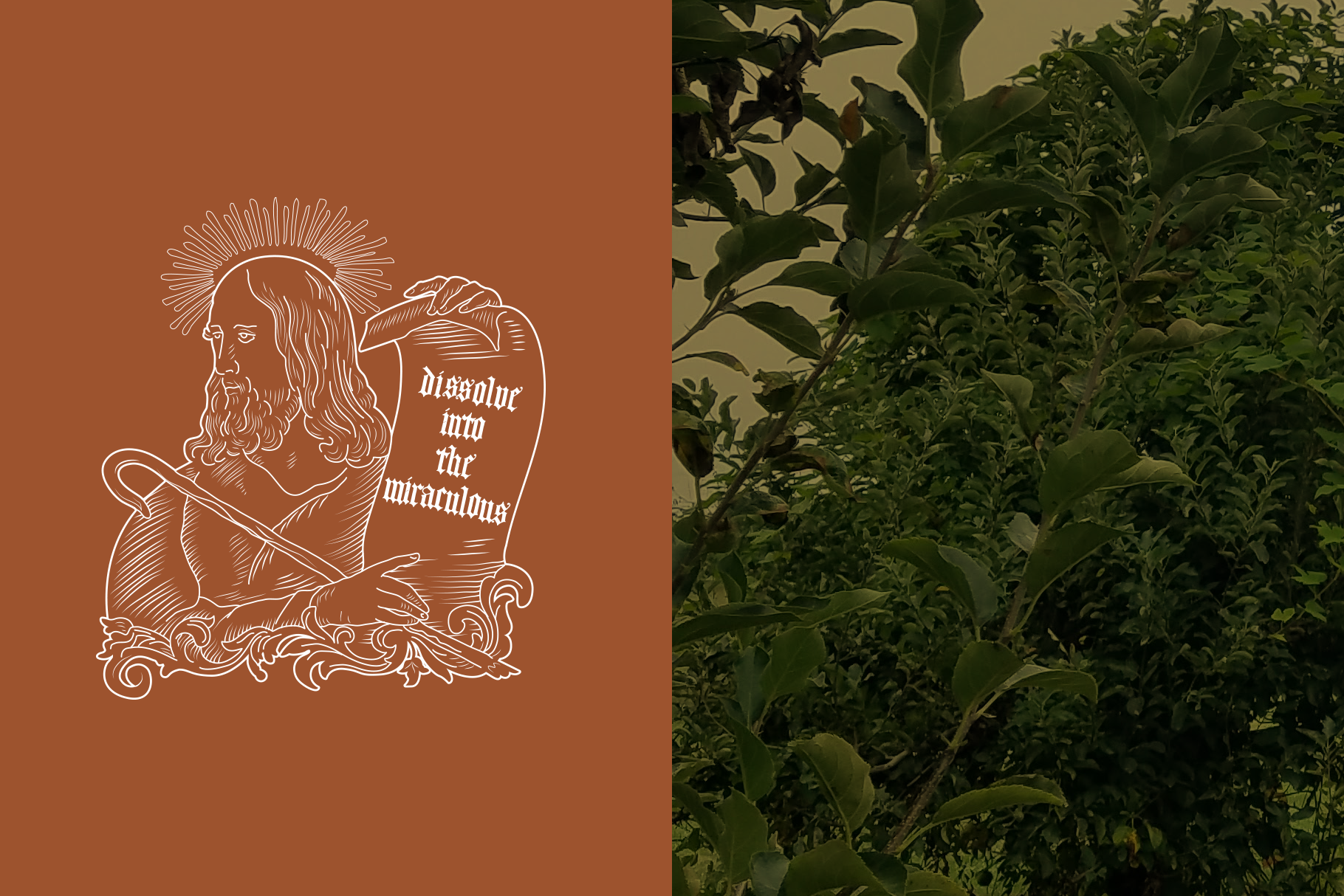
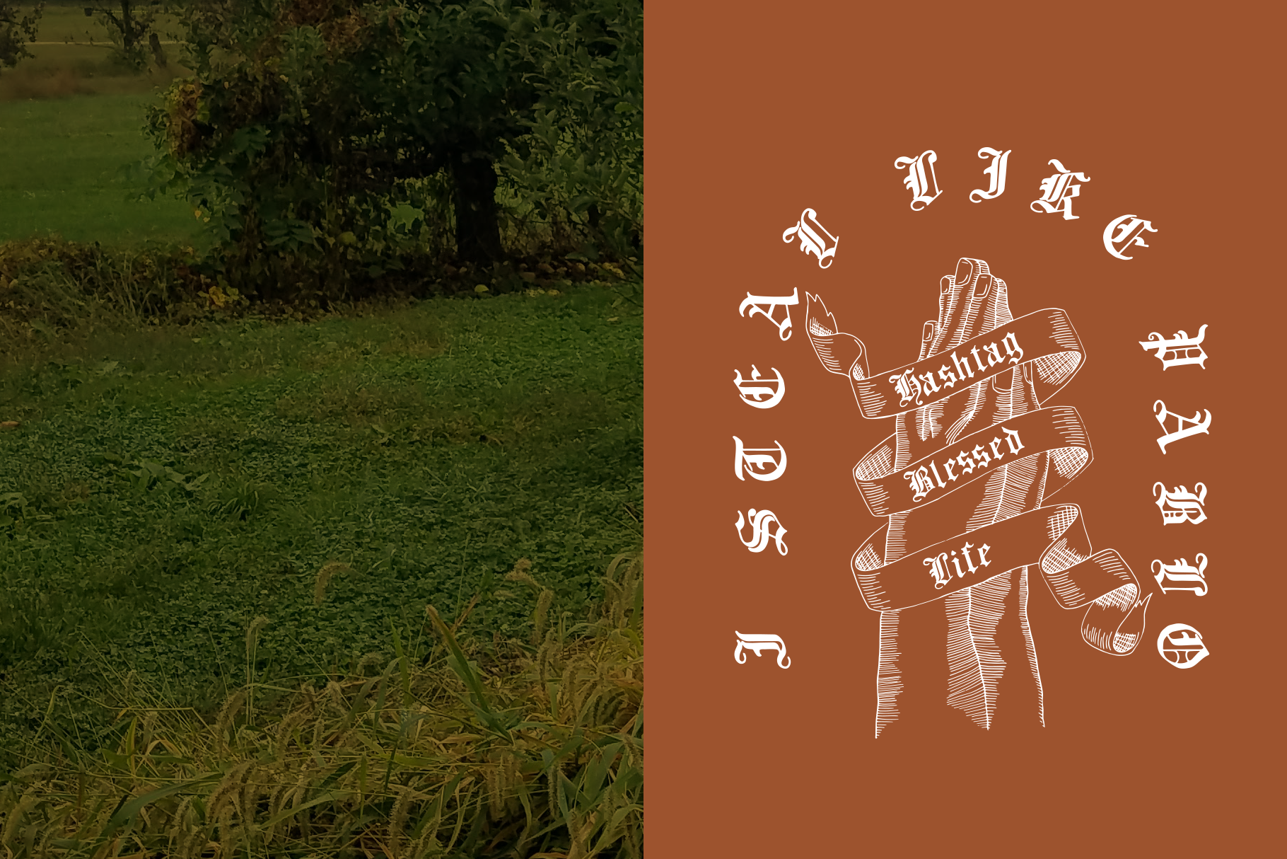
I use this font in my work specifically when I'm looking for a blackletter that shys away from that overly-perfected look (the way, in my mind, blackletter is supposed to be - slightly janky).
I like to think of the tedious copying of passages of literature before the printing press, imagine making the last mark at the end of the passage, sore wrist and ink-stained fingers, and noticing that *ONE* letter is *SLIGHTLY* crooked, you're not gonna burn the whole page just for *that*. You wrap up the scroll and hope no one notices. This font is an homage to that moment.
Suggested use: Pablo Tee rip offs, church bulletins, pre-1600 literature book covers.
-----------------------------------------------------------------------------------------------------------------------
**What's included?**
- Blackletter1905.otf
---------------------------------------------------------------------------------------------------------------------------------------------
** Can I use this in _____ project? **
Shoot me an email or message. Most likely yes.
---------------------------------------------------------------------------------------------------------------------------------------------
*Shoot me a message with any questions!*
Jeffry
| File Type: | OTF |
| File Size: | 78.7 KB |