Responsive Screen Simple Mockups Set
in Templates / Mockup Templates / Mobile & Web Mockups
DOWNLOAD NOW Report
100
0
YOU MAY ALSO LIKE:
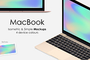
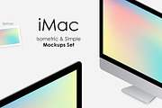
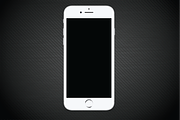
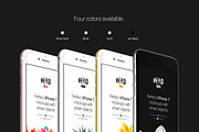


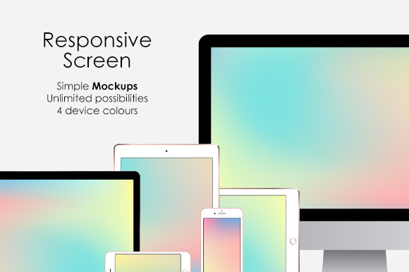
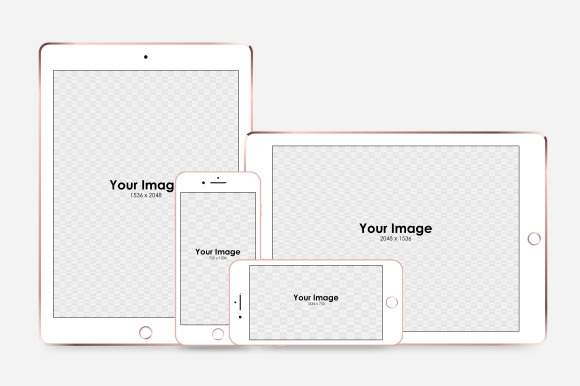
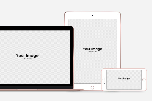
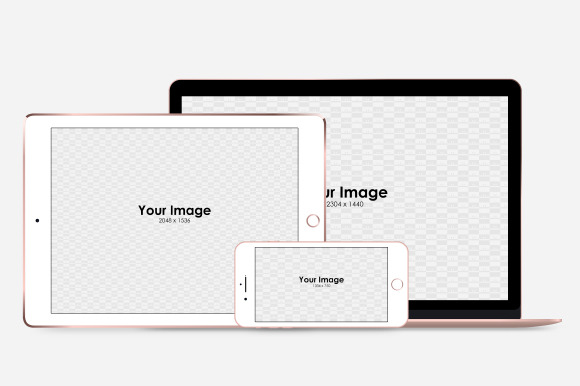
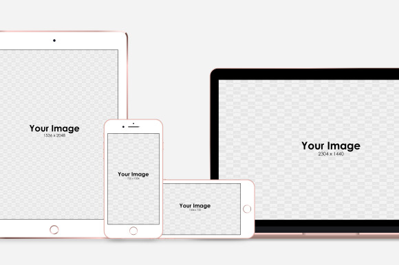
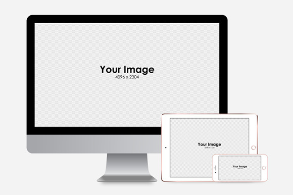
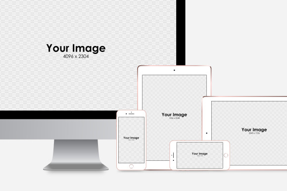
The responsive Apple devices mockups set allows you to quickly showcase your designs on iPad, iPhone, iMac and MacBook screens in multiple front views. Simply save your design / layout / screenshot in smart objects to display it instantly on the screens of the virtual devices. You don't have to rotate, mask nor crop anything, as it's done for you automatically.
---
**Features**
- Generates automatically photorealistic simple front views of iPad, iPhone, iMac and MacBook
- includes: 2 x iPhone views, 2 x iPad views, 1 x MacBook view, 1 x iMac view and 11 x example compositions
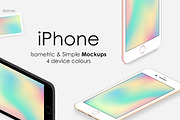
- **4 device colours** (iPad, iPhone, MacBook): gold, rose gold, silver, space grey / black
- Size: 4000 x 4000 pixels
- Layered
- Minimalist, clean design
- Easy to change background color
- Compatible with Photoshop CS6 and all the CC versions.
---
**Package includes:**
- PSD file with set of photorealistic, clean Apple devices mockups in simple front views and example compositions
- Short instructions file.
---
Any comments, suggestions and rating are highly welcome. I'll appreciate it very much.
Thank you, enjoy!
---
**Features**
- Generates automatically photorealistic simple front views of iPad, iPhone, iMac and MacBook
- includes: 2 x iPhone views, 2 x iPad views, 1 x MacBook view, 1 x iMac view and 11 x example compositions
- **4 device colours** (iPad, iPhone, MacBook): gold, rose gold, silver, space grey / black
- Size: 4000 x 4000 pixels
- Layered
- Minimalist, clean design
- Easy to change background color
- Compatible with Photoshop CS6 and all the CC versions.
---
**Package includes:**
- PSD file with set of photorealistic, clean Apple devices mockups in simple front views and example compositions
- Short instructions file.
---
Any comments, suggestions and rating are highly welcome. I'll appreciate it very much.
Thank you, enjoy!
| Compatible with: | Adobe Photoshop |
| File Type: | PSD |
| File Size: | 10.55 MB |
| Dimensions: | 4000 x 4000 px |