


Stratford Sans
in Fonts
DOWNLOAD NOW Report
142
0
YOU MAY ALSO LIKE:
-.jpg?1530775194&s=3bcd1bc322675a2aacb7f78aec4ed037)
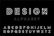


**This font looks best when it's used as mostly capital letters with the odd lower case to add contrast and personality. Also, when the tracking is set to 150 - your title is sure to look classy and rad all at once.**
The objective of Stratford Sans was to pull from both ends of the spectrum through combining vintage + modern typographic elements to create a font that would seamlessly amalgamate itself into the story of your designs.
After lots of typographic exploration, coffee, and conversations - I have decided that Fonts I design will have the names of places that have been integral elements of my journey. Without further ado, I introduce Stratford Sans.
The initial design process pulled from finding a voice for the city of Stratford, Ontario. The city has a strong scene of traditional arts + culture and is focused on adding digital culture + flair to the mix. The city is expressive, traditional, and unexpected. Therefore, elements tipping a hat to traditional British letterforms and the fluid combination of grotesque era ovals and unforeseen hints of geometric characters are what truly send Stratford Sans into a realm of its own. The initial design decision was that Stratford Sans would, in fact, be a sans serif font. This is to pull away from its branding of traditional arts and giving it the opportunity to newly define itself, whilst still allowing the magic that is its history, to seep through its characters. Interlacing two conflicting themes gives you the ability to craft a harmony between the two: to pull the exciting and non-negotiable defining elements of each - and defining a new sensation.
I hope you love the font as much as I loved crafting it.
Best,
Vic,
from @BonaFideCraft
---------------------------------
**bonafidecraft.ca**
| File Type: | TTF |
| File Size: | 17.84 KB |