


Rail Engineer | 20 styles
in Fonts / Slab Serif Fonts
DOWNLOAD NOW Report
324
1
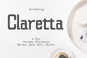
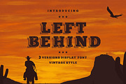
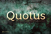
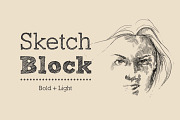
YOU MAY ALSO LIKE:


**Rail** | *grandeur precision & leverage*
---
Rail is the best conveyance mechanism for your written communication. Precision, innovation and experience are the main foundation for this grandeur slab serif. It’s designed to provide great comfort and reduce any possible friction for your eyes. It’s highly recommended for complex typography projects like magazines and annual reports as well as for signs, headers and other inscriptions.
The precise construction of this slab serif signals the greater effectiveness of the letters that are coupled together in a beautiful harmony. Its construction is very legible, pleasant and familiar.
It is suitable for longer texts, information graphics and books.
The typeface’s x-height is around 70% of its capitals. Rail italic is constructed at 11° angle. It is developed to provide real italic construction but enhanced with mechanical appearance. This makes the whole typeface unique and recognizable.
---
Complete family | 20 styles
---
www.typefleet.com
---
Rail is the best conveyance mechanism for your written communication. Precision, innovation and experience are the main foundation for this grandeur slab serif. It’s designed to provide great comfort and reduce any possible friction for your eyes. It’s highly recommended for complex typography projects like magazines and annual reports as well as for signs, headers and other inscriptions.
The precise construction of this slab serif signals the greater effectiveness of the letters that are coupled together in a beautiful harmony. Its construction is very legible, pleasant and familiar.
It is suitable for longer texts, information graphics and books.
The typeface’s x-height is around 70% of its capitals. Rail italic is constructed at 11° angle. It is developed to provide real italic construction but enhanced with mechanical appearance. This makes the whole typeface unique and recognizable.
---
Complete family | 20 styles
---
www.typefleet.com
| Licenses Offered: | Standard |
| File Type: | TTF, OTF |
| File Size: | 2.44 |
| Vector: | Yes |
| Web Font: | Yes |