Chocolate Alphabet Trio
DOWNLOAD NOW Report
223
1
YOU MAY ALSO LIKE:

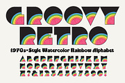


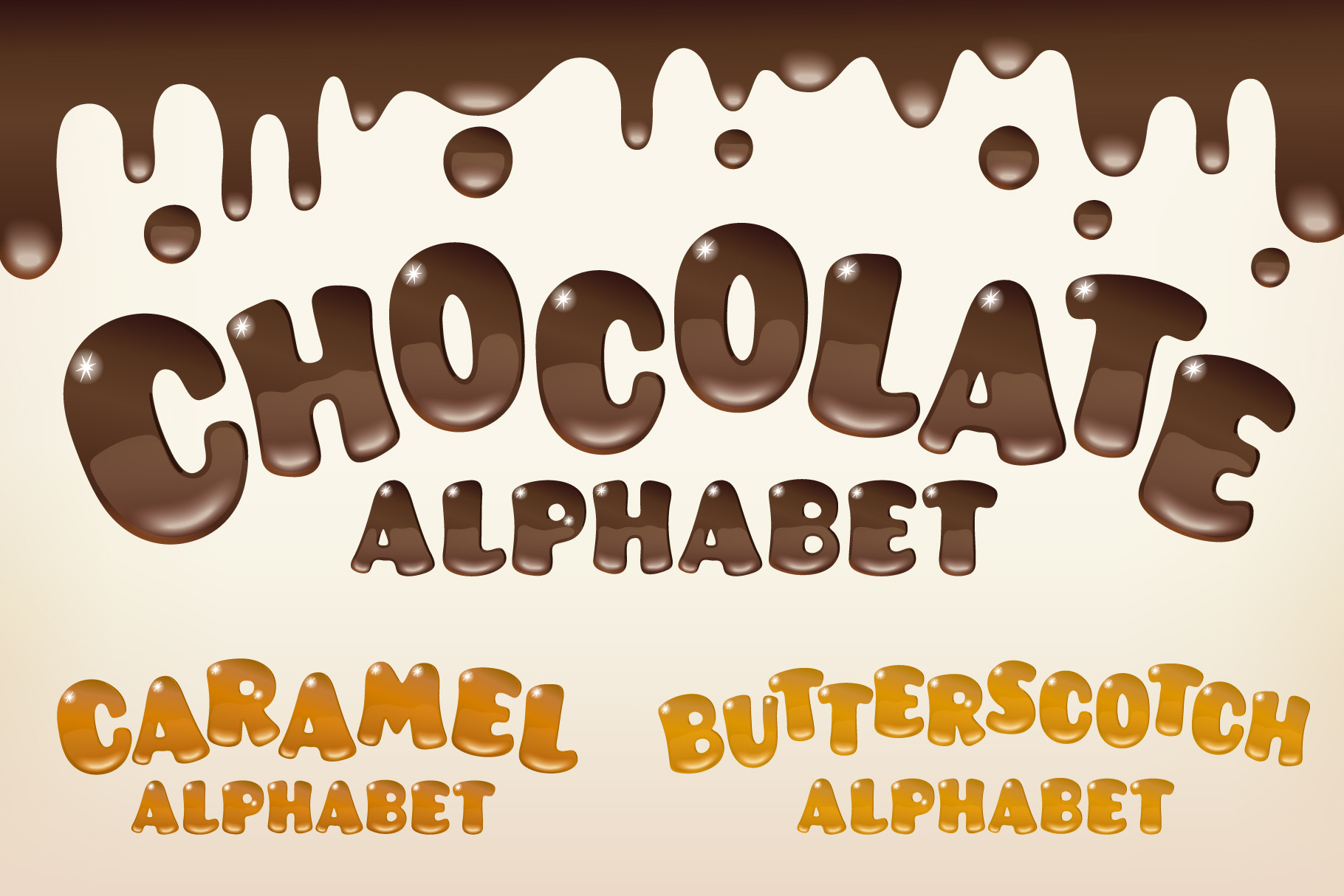
CHOCOLATE, CARAMEL & BUTTERSCOTCH ALPHABETS
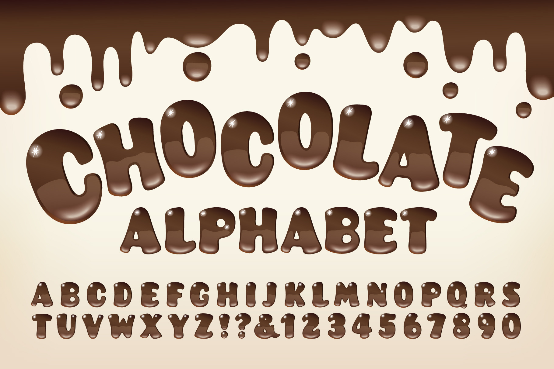
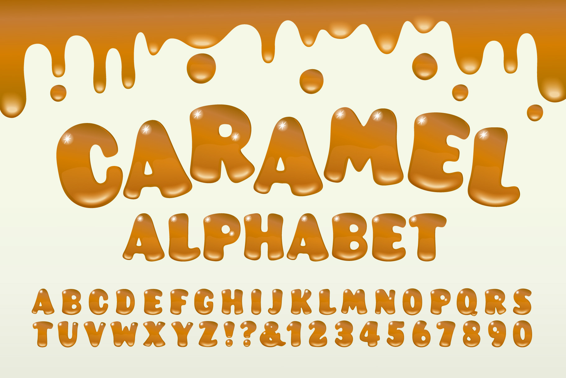
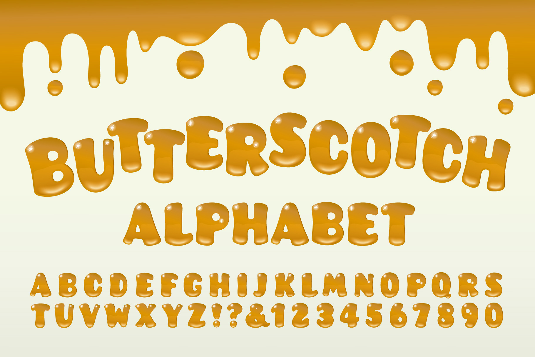
Here's a yummy trio of vector art alphabets, along with a matching gooey drip design at the top for each one. You're getting three complete sets of capitals, numerals, ampersands, and exclamation and question marks; perfect for spelling out scrumptious-looking titles, and for sending just the right flavored message for branding, events, social media, or other communication graphics.
• Important Note: This is custom vector art, not an installable font.
• Saved in .eps format, compatible with AI 10 and up.
• To open in PhotoShop, drag the file onto the PS icon, choose a resolution, and rasterize it.
CUSTOMIZED VECTOR ALPHABET DESIGNS, AND HOW TO USE THEM
When it comes to designing a truly unique lettering design or branding system, sometimes PhotoShop or Illustrator styles & actions don't quite yield the highly customized results you may be looking for.
These stand-alone vector lettering designs are uniquely intricate in their use of ornate flourishes, zig-zag or hatched contours, solid and gradient drop shadows, faux-metallic gradients, and other eye-catching effects. These are details that can't be accomplished through Illustrator or PhotoShop styles, actions, or filters.
In a matter of just a few minutes, you can copy and paste the letters to spell out a customized headline or product name, apply beautiful curves and contours if desired (using Adobe Illustrator's Object Envelope Distort commands), and presto, you have a lovely, unique, and custom-lettered branding system or headline. And yes, it goes more quickly than you might think.
TIPS FOR GETTING A PERFECT RESULT
1) Don't forget the kerning! This is often the difference between a good lettering design and a great one. After you've positioned the lettering on a straight baseline, give it careful look. Squint at it. Look at it from across the room if it helps. Close up the big wide gaps like you might see between an 'L' and an 'A'. Open it up a bit when dense letters want to dovetail too tightly together. Bottom line: Don't use math or rulers to kern the letters, use your eyes. If it looks too tight or too loose, then it is.
2) If you've positioned individual vector letters before, you probably know that letters with rounded tops or bottoms need to extend a little bit below the baseline and above the cap height line. Example: a rounded capital letter 'O' extends slightly beyond the lines at both the top and bottom, and a rounded capital letter 'U' extends below the line at the bottom only. This extra height (most prominently on bold lettering) counteracts the optical illusion of rounded letters naturally appearing smaller than the rest.
3) Try curving your words, rotate them around an arc, bend and warp them for great results. Adobe Illustrator's Object Envelope Distort is your friend.
4) The colors are editable of course, although in some cases, it may prove to be overly complicated to edit some of the multiple gradient swatches used for creating the 3-d style drop shadows and faux-metallic shine gradients. Experiment, and see what works.
ABOUT THE DESIGNER
Mott Jordan is a veteran typography designer and confirmed lettering fanatic. He has two ITC designs to his credit (now administered by Monotype, Inc.), ITC Hornpype™, and ITC Verkehr™, as well as a large number of limited-release freebies floating around the web, dating back to the late 1990s. Jordan is also an artist, illustrator, animator, 3D designer, and photographer.
| File Type: | EPS |
| File Size: | 13.88 |
| Vector: | Yes |
| Layered: | Yes |
| Compatible with: | Adobe Photoshop, Adobe Illustrator |